Izzy is a new Pod / E-liquid brand with strong flavors and a powerful visual. This is a brand that wants to be recognized for the essential quality of its products as well as the consistency in its cool and relaxed look. Izzy is not shy about showing an explosion of colors and experiences.
For a good visual performance of the logo along with the products and graphic elements, it was established that the color gamut would be very rich and comprehensive, giving preference to more vivid colors and with a lot of presence.
The graphic elements used in the Branding range from visual support to complementing flavors. Thus, the logo and colors always talk to each other along with the final product.
These are the standard illustrations:
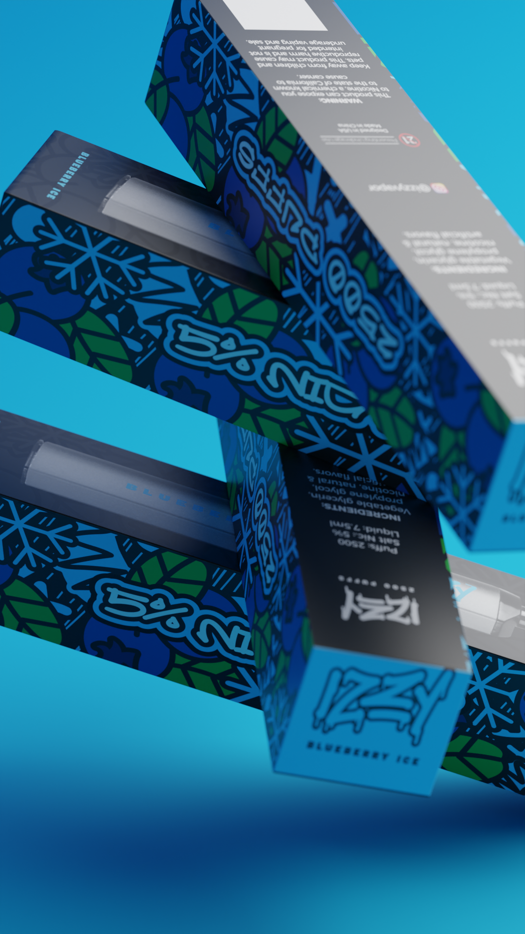
To complement the "standard illustrations" illustrated fruits were inserted following the same style and stroke. With a total of 24 illustrated fruits including the launch of the first line of pods, the mixed line and the latest line of juices.
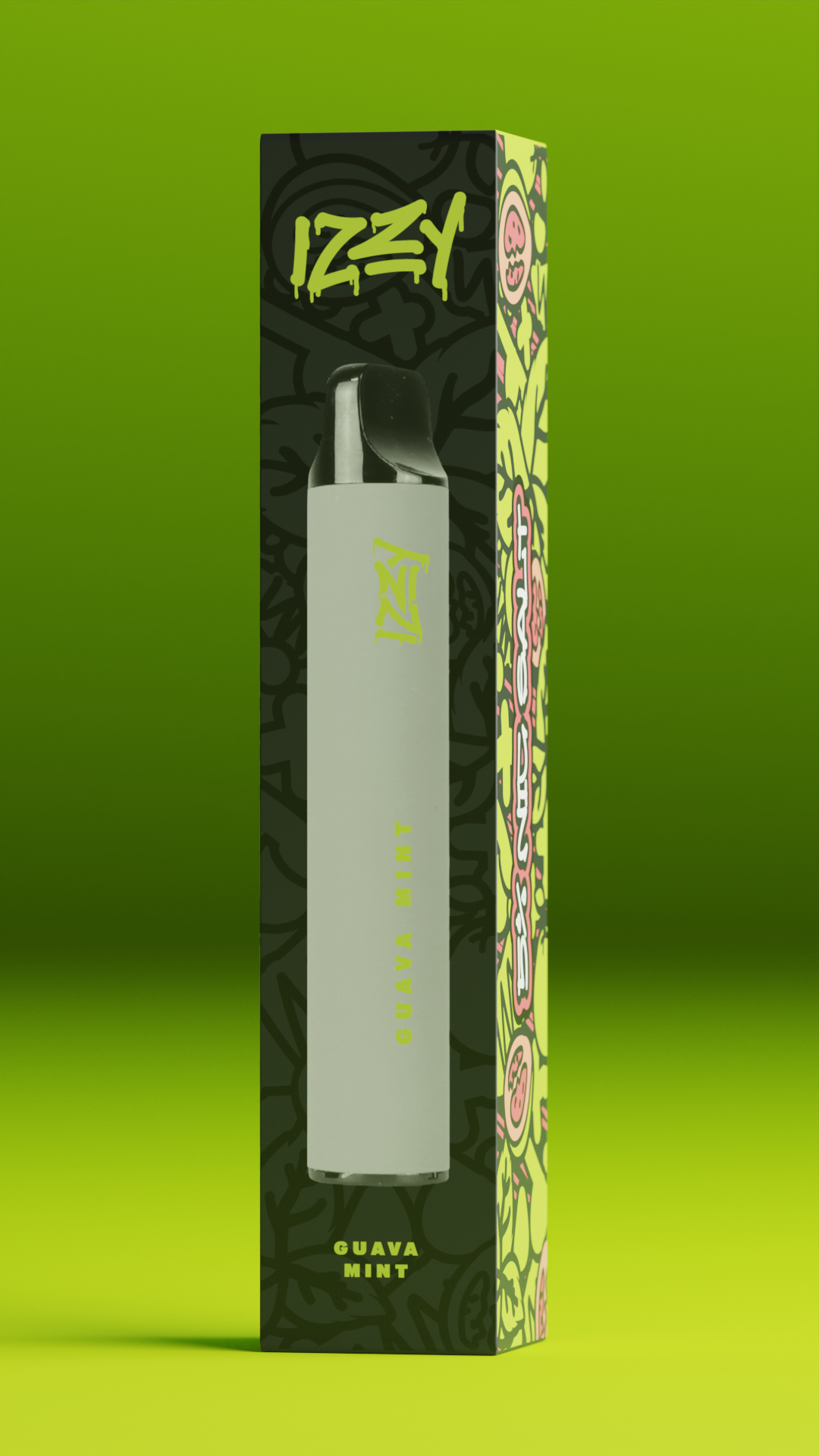
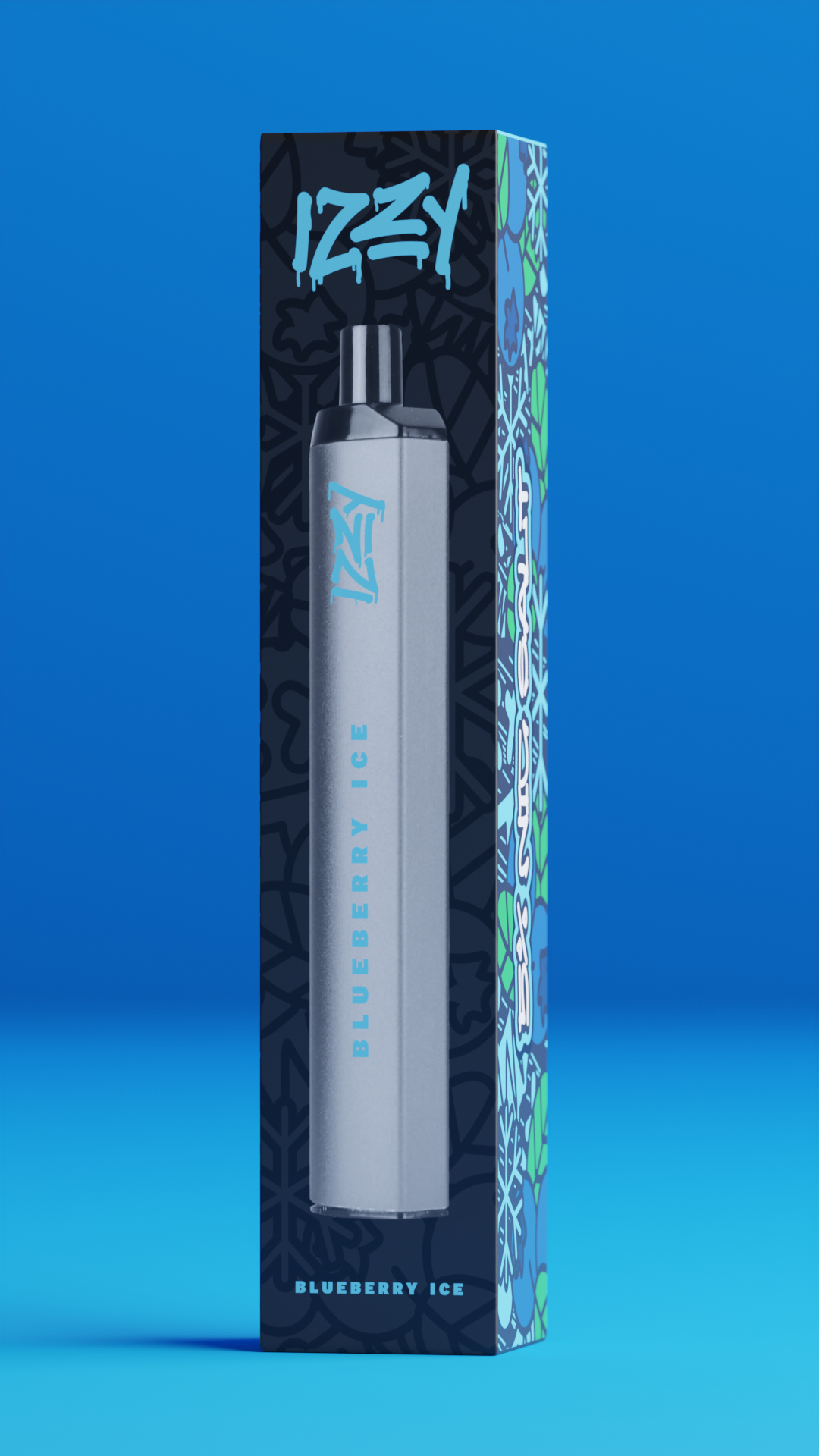
The first phase of the project was based on the launch of the first pods on the market. The flavors were pure and with the addition of mint they made for a powerful vaping experience. This first batch of products brought 3 models with different amounts of puffs for you to enjoy that quick hang out or a wild ride until dawn!
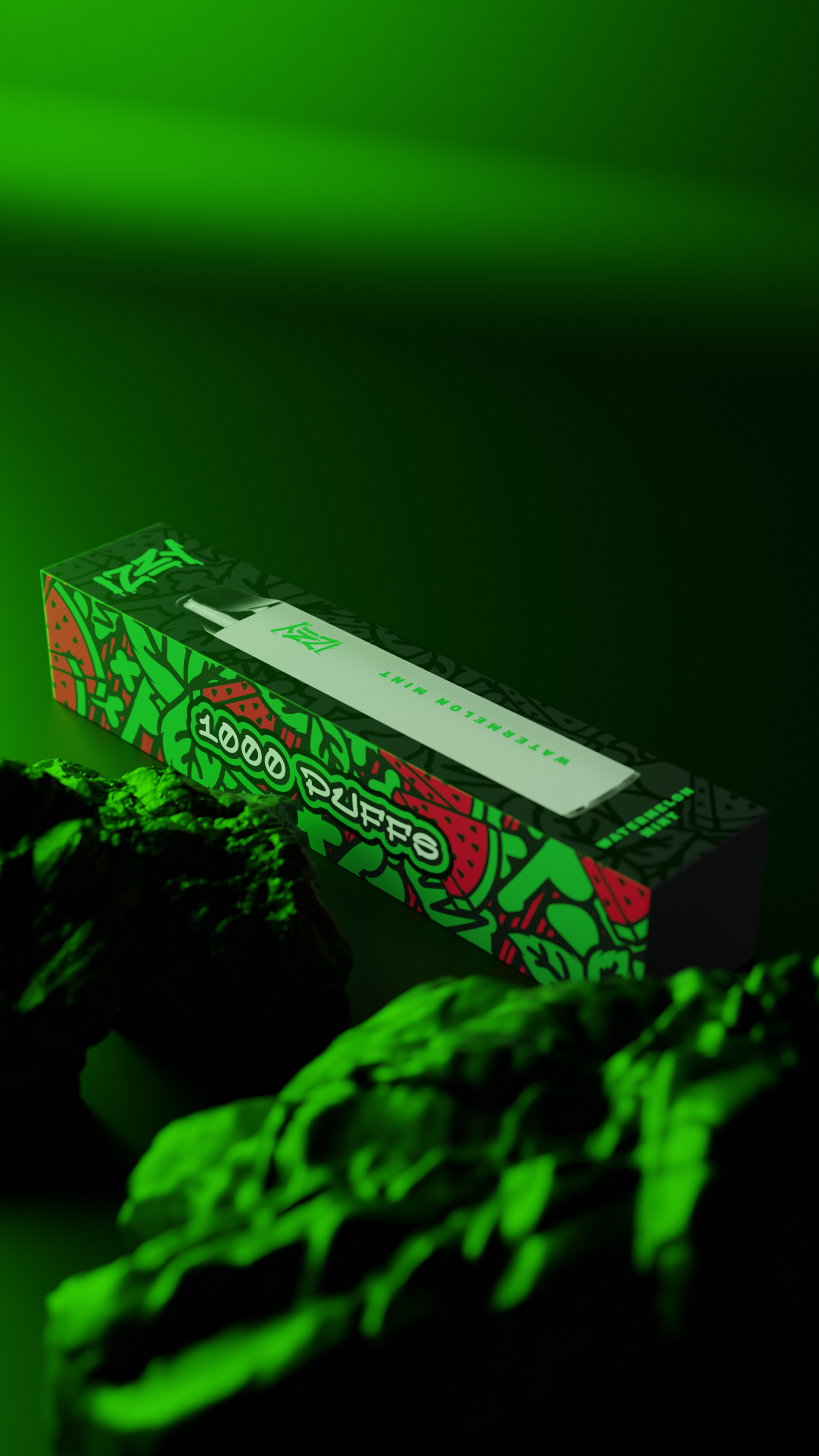
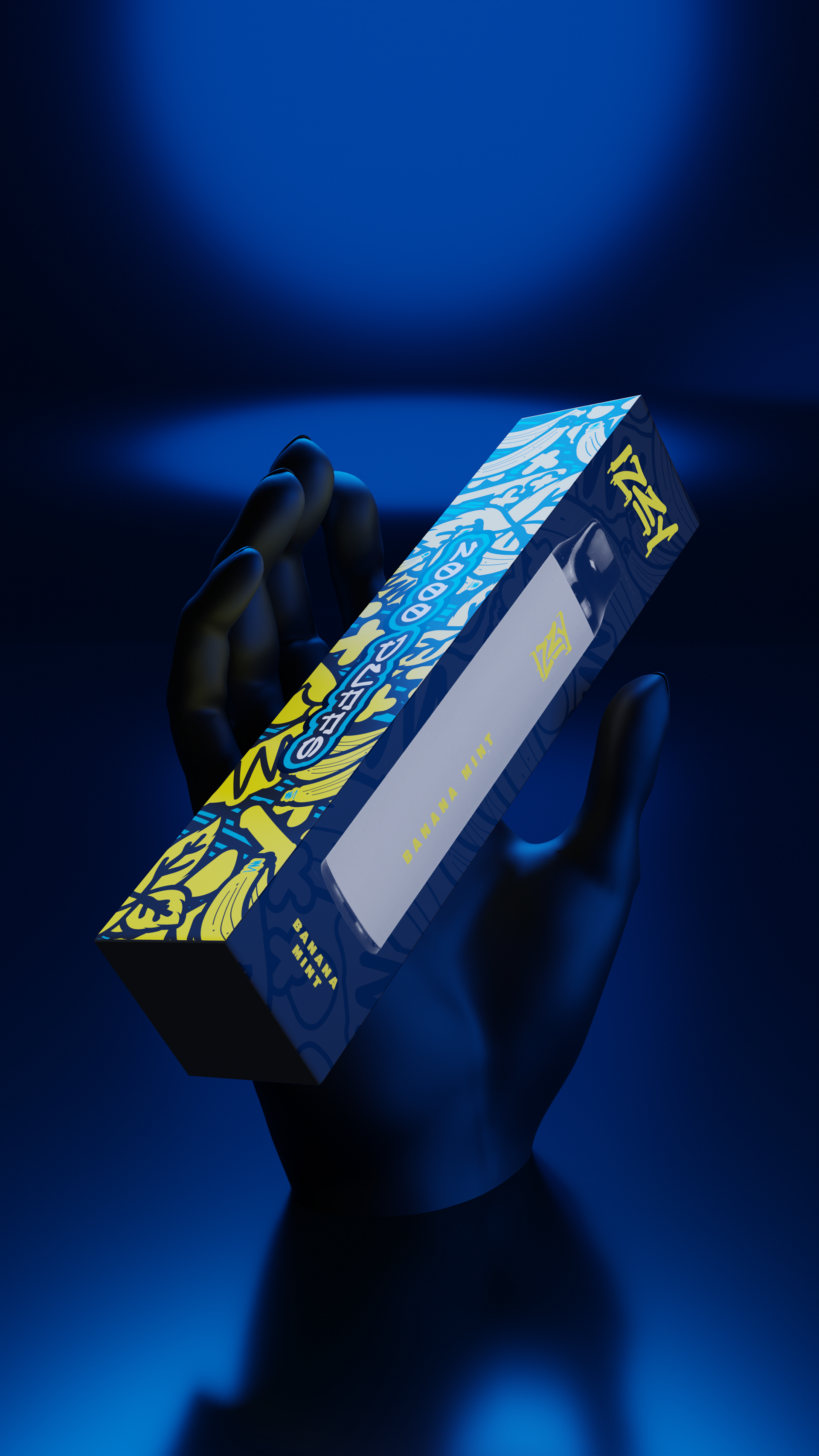
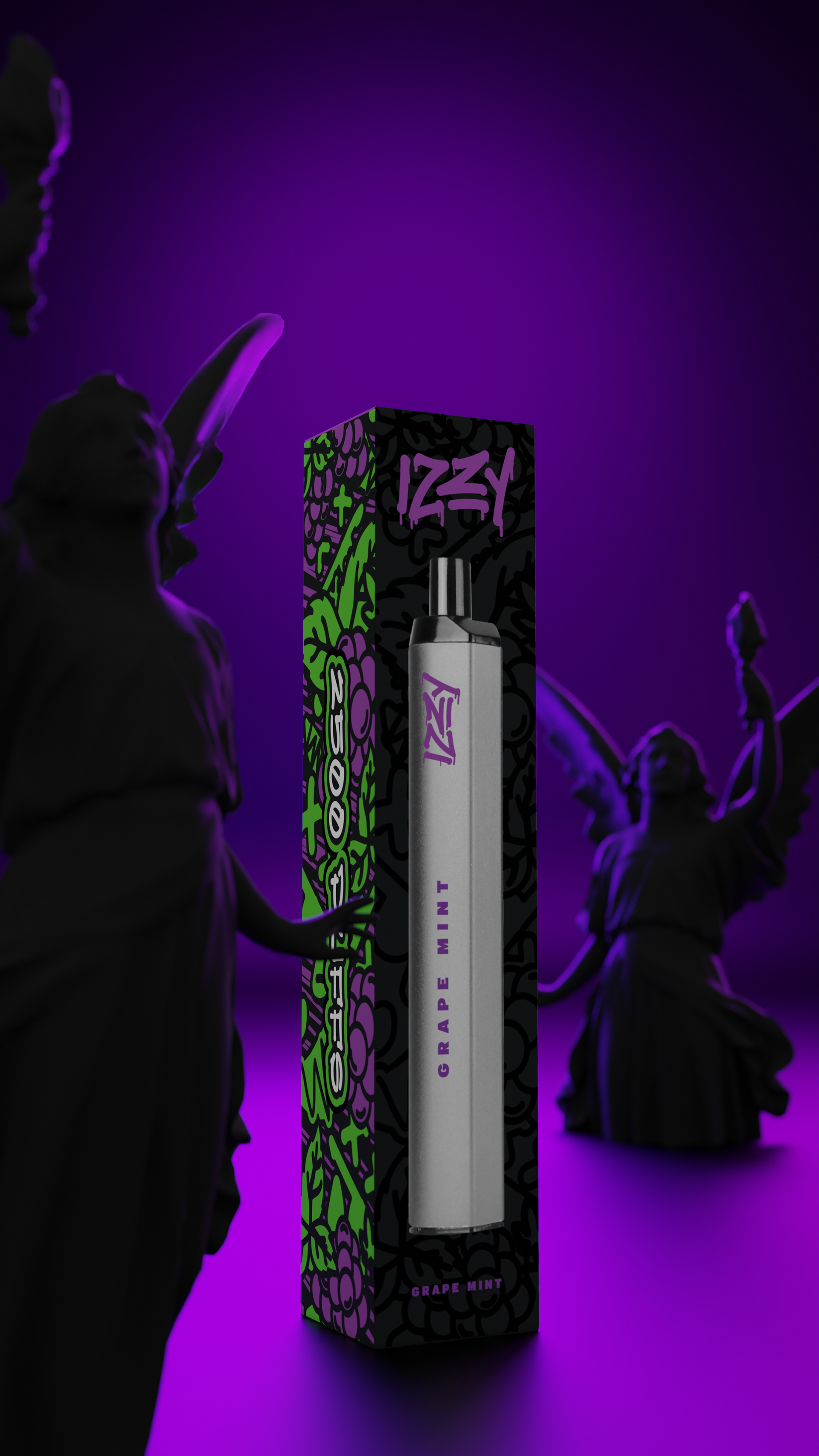
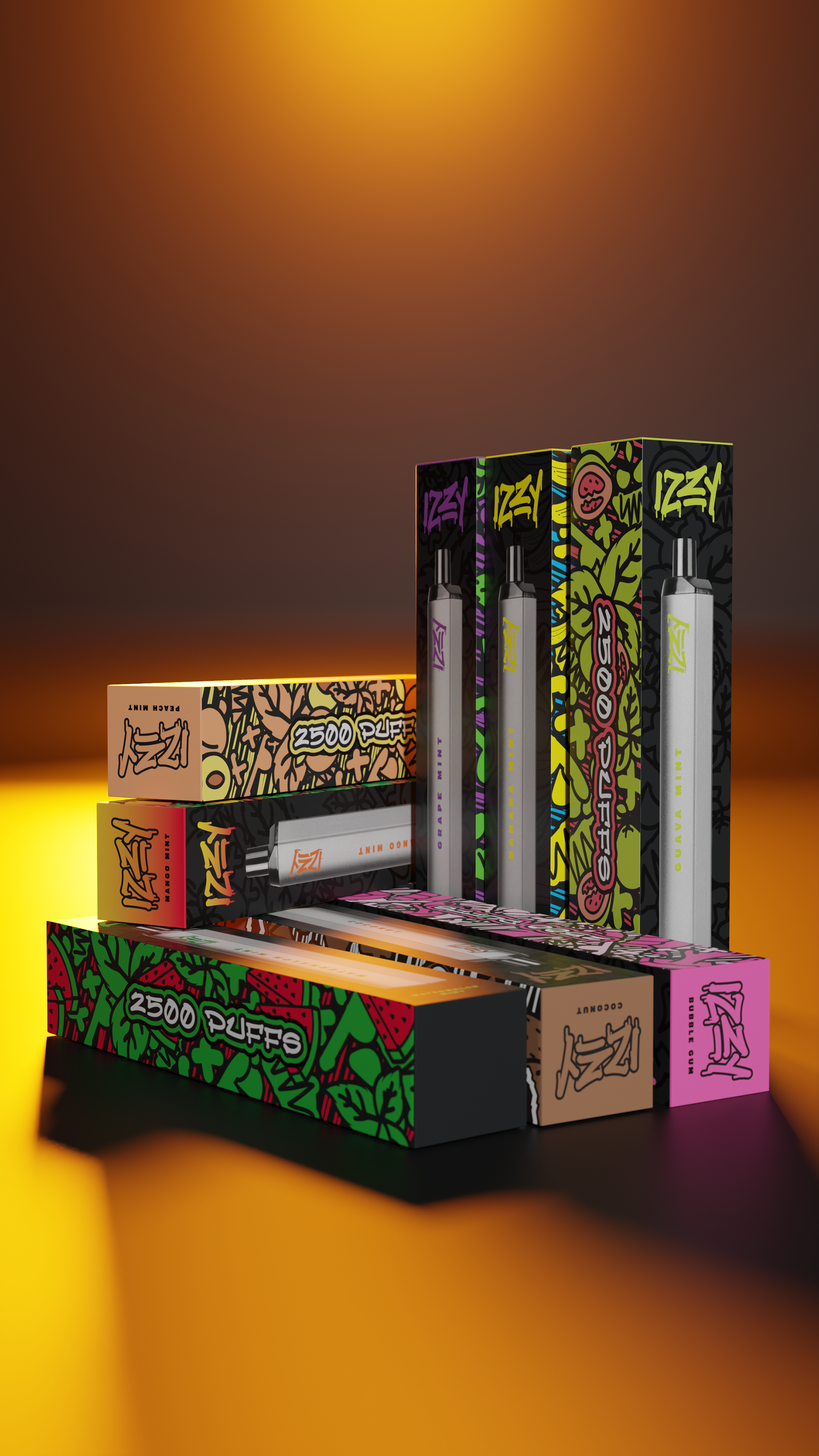
The device has an industrial design to stand out among competitors in addition to enhancing its colorful identity.
Composed by 9 initial flavors, all of them with focus on a most pure taste of the product. Mint was added after some tests.
A creative mix of various flavors. This 2nd drop it's most experimental. The main objetive it's the feedback of our customers.
The third drop it's our juicy session! Nothing better than vape and feel the real tasty flavor of the fruit, and that's the main concept of Izzy's e-liquid. We adapted the pod's illustration to work on the e-liquid packaging but with a few differences.


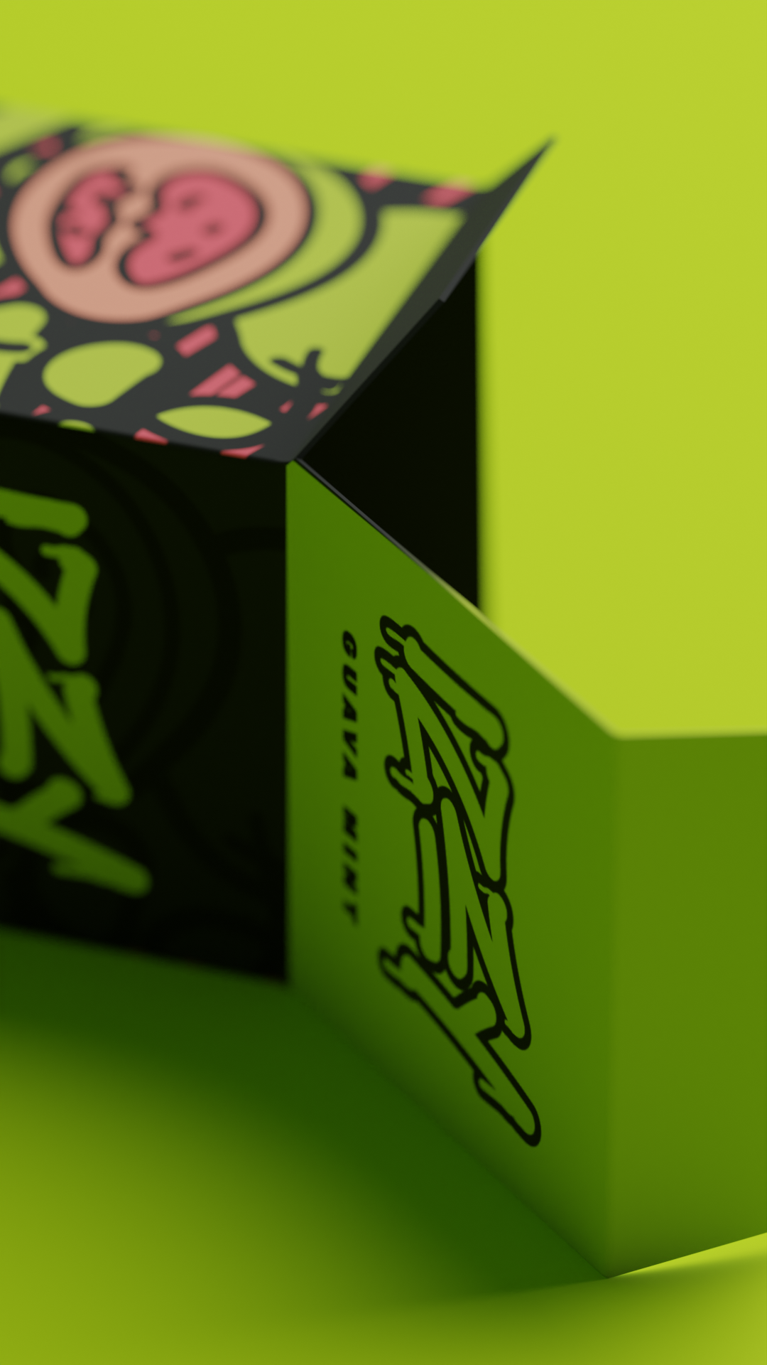
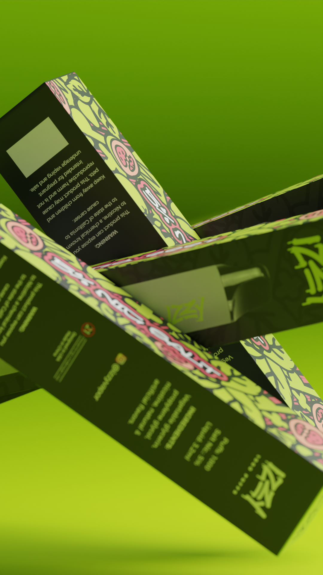
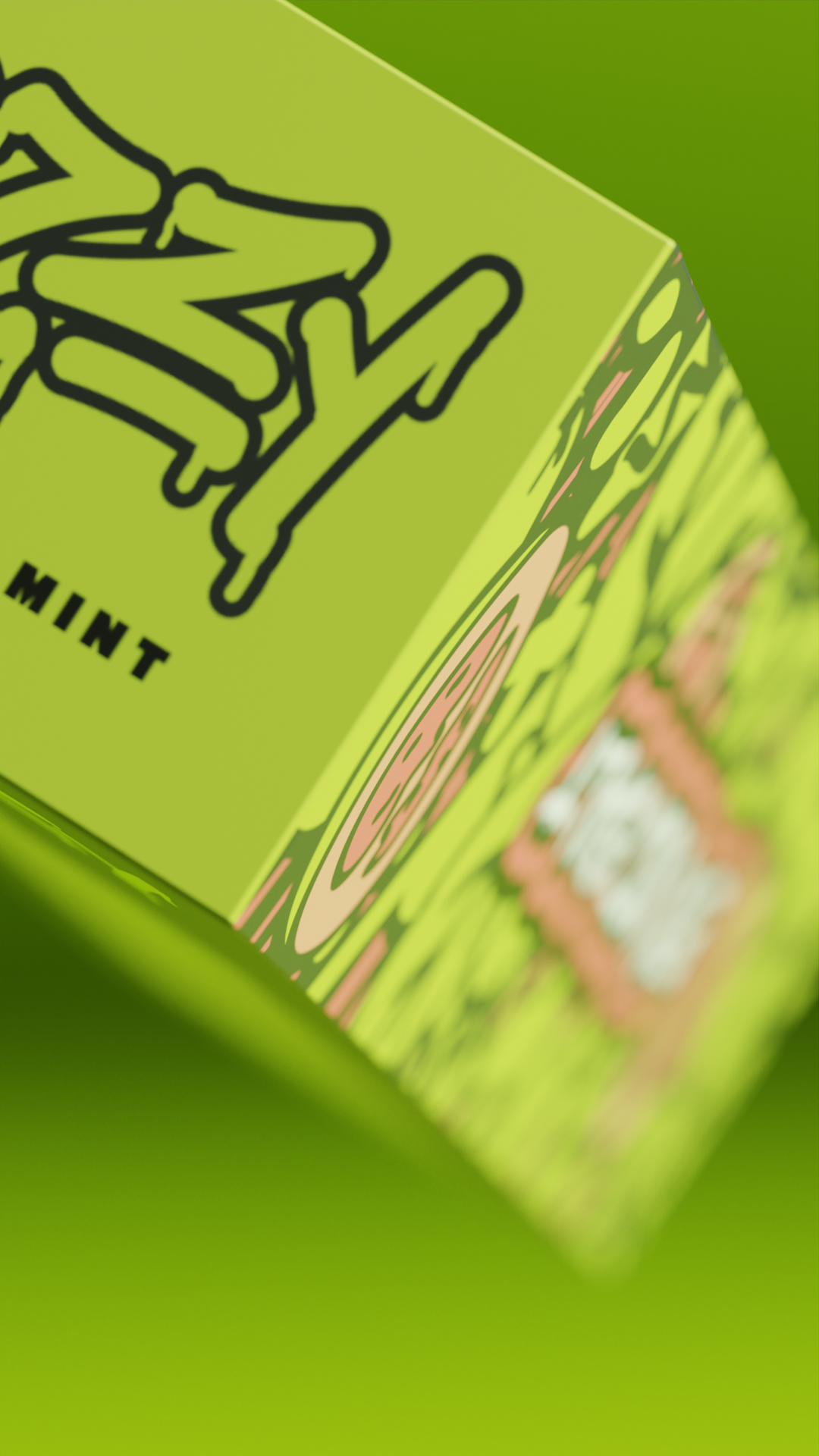
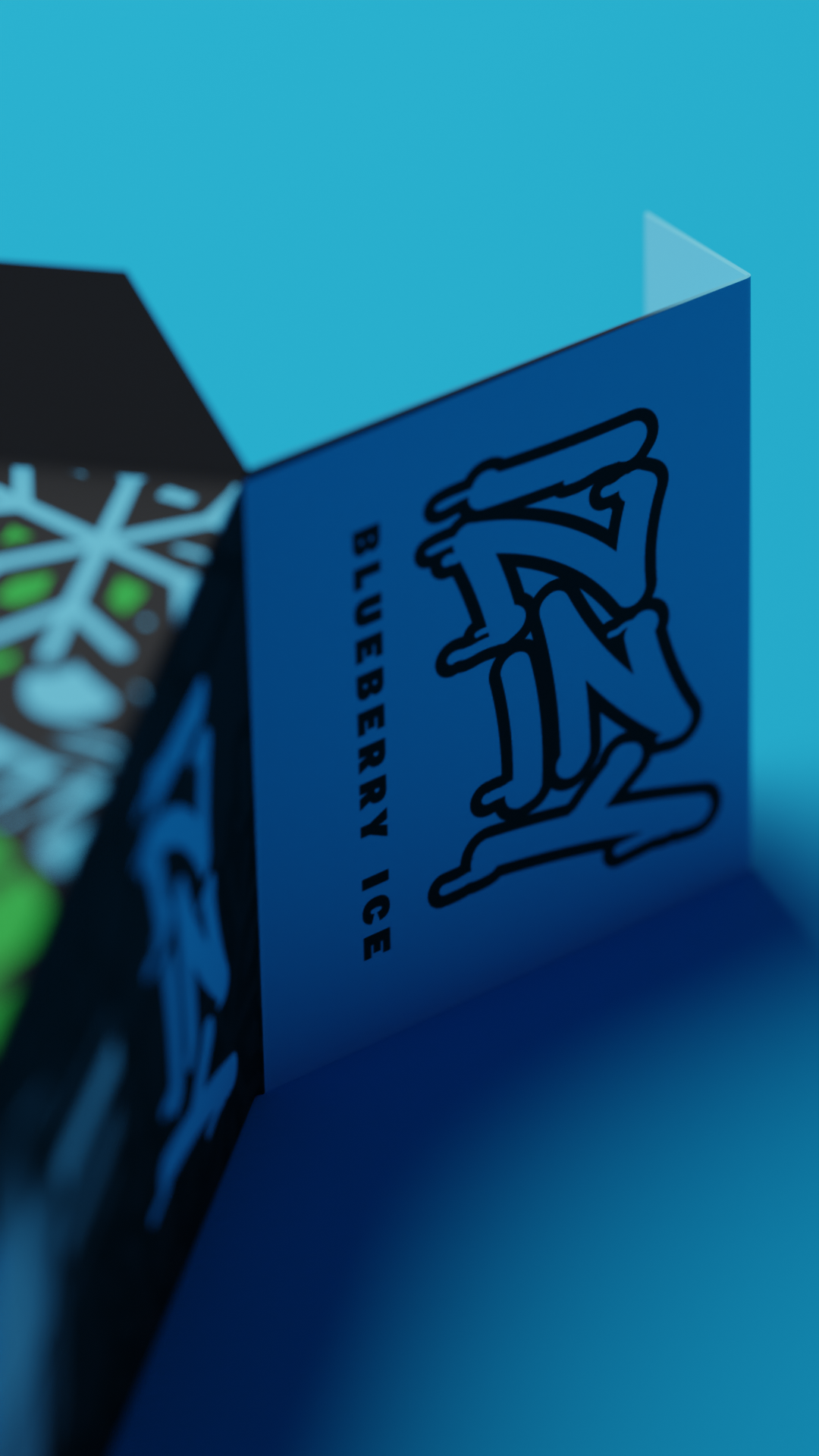
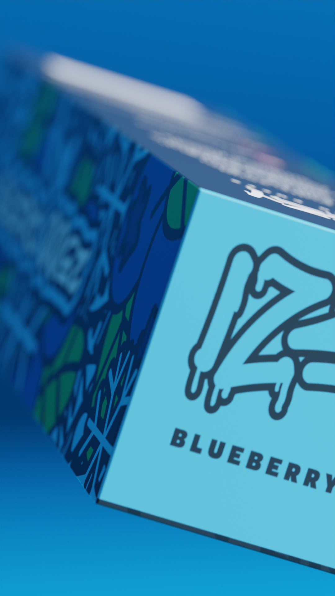
The packaging design was aligned to the brand itself. Cool and confident. Always taking advantage of the colors and illustrations.
T H A N K S F O R W A T C H I N G !
